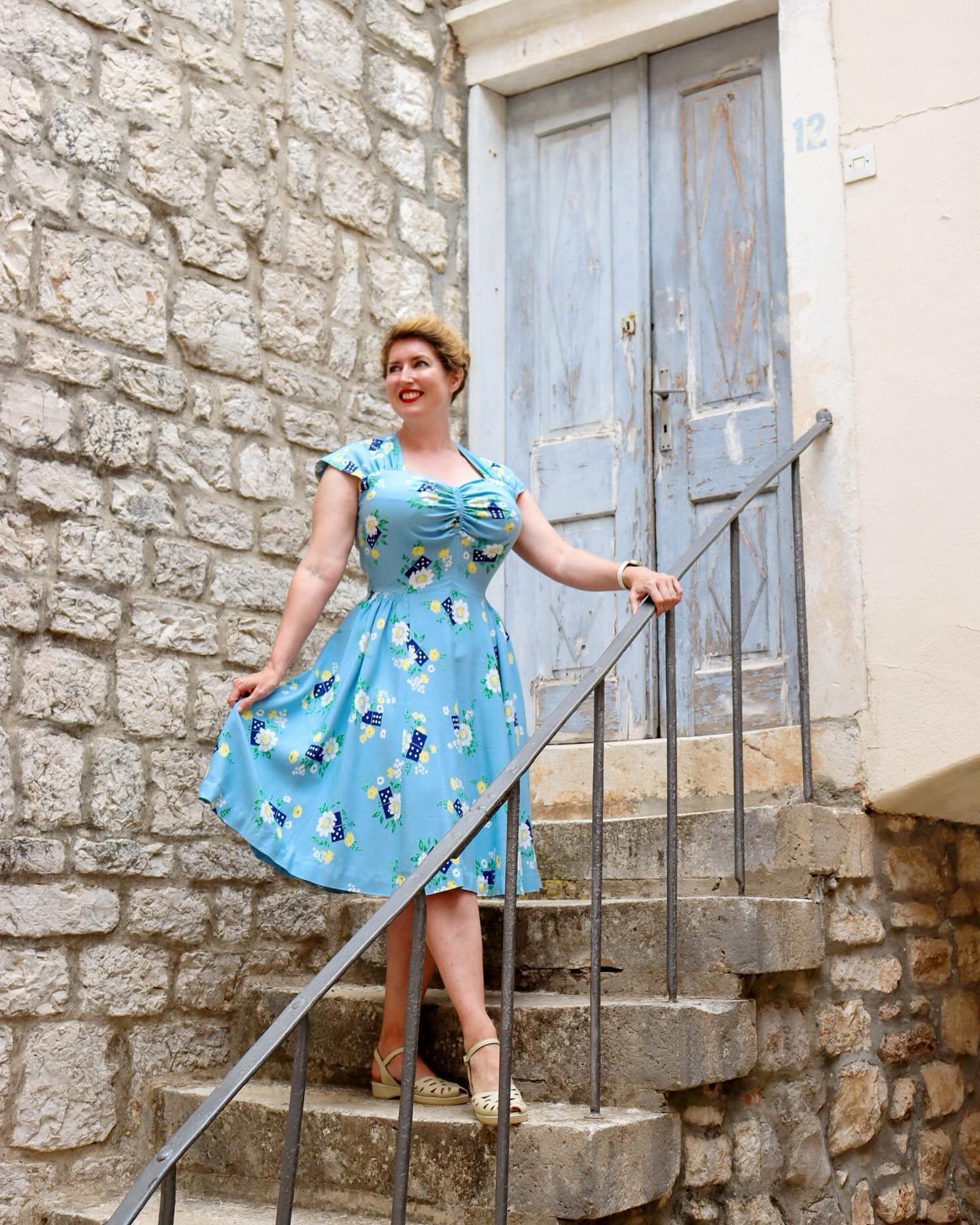
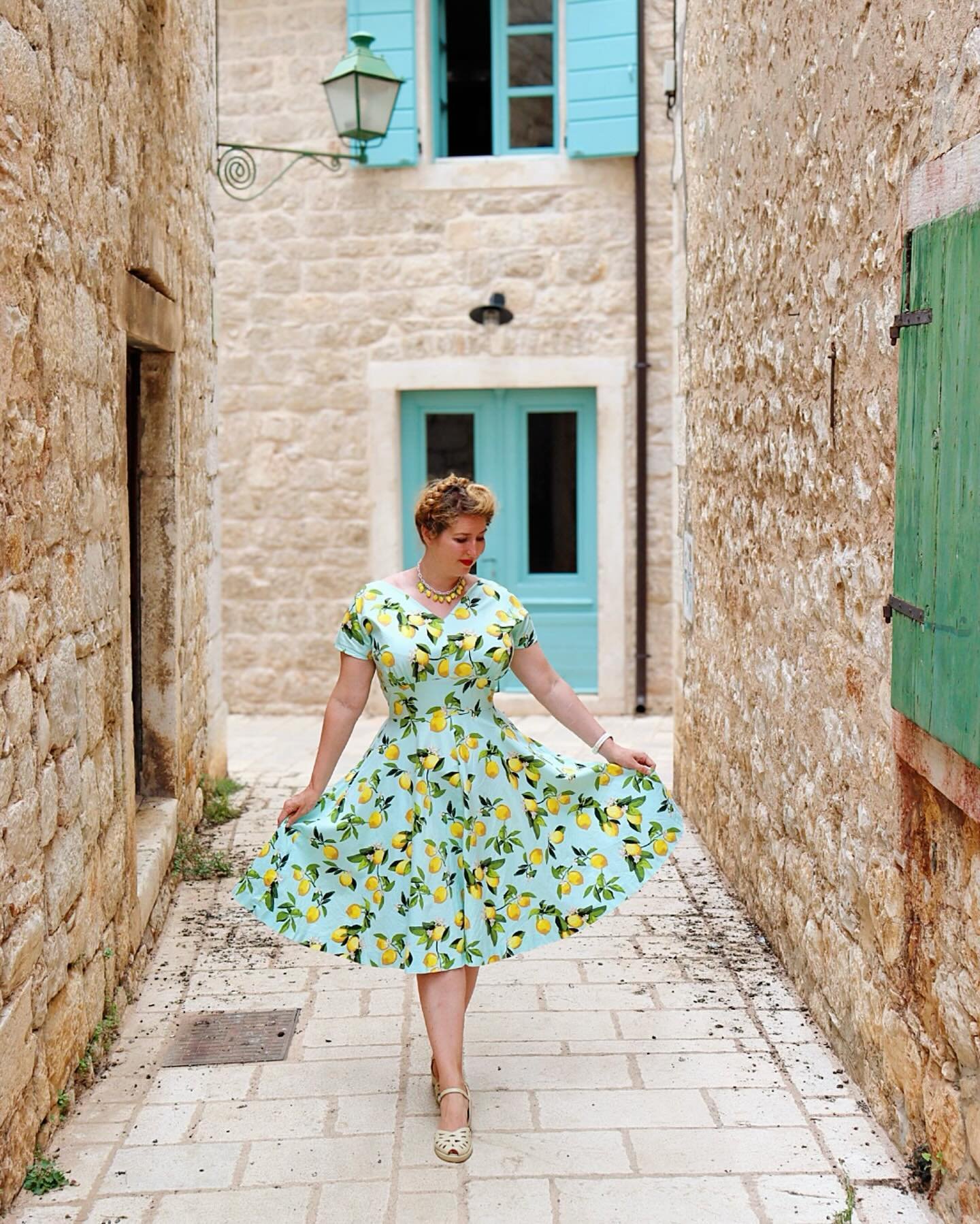
Colour gives me life. So much of the available reference material showing fashions from the early to mid part of the 20th century - such as photographs, magazines and catalogues - are in black and white, but life was colourful! I love discovering the colour palettes that were around back then, colour-printed style features; the advice in magazines on the latest fashionable colour combinations; and “this year’s colours” in mail order catalogues.
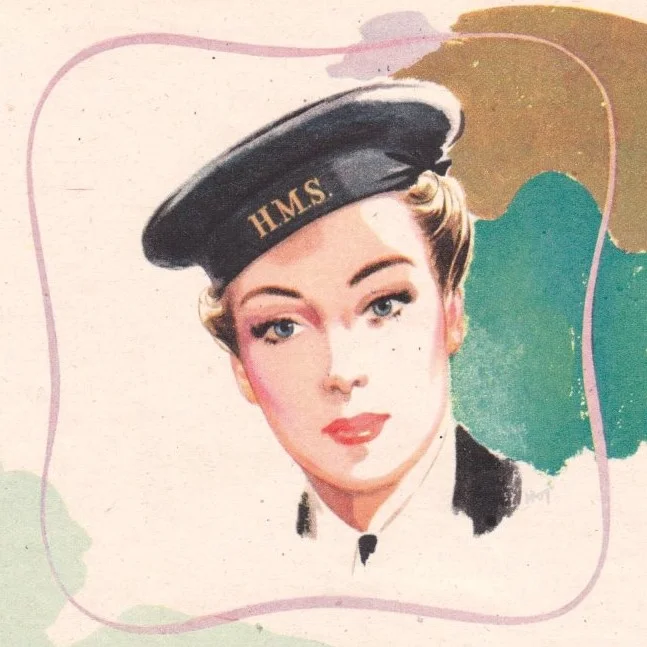
Put Your Best Face Forward (Yardley 1942-43)
Yardley ran this series of wartime adverts over 1942/3. Each shows a woman engaged in "war work" - Wren, factory girl, nurse - and a patriotic message encouraging women to "work hard and let no weariness appear". The superficial read of course is that a woman’s duty above all is to be decorative — but, if you look at it a bit deeper, what intrigues me about this campaign is the focus on a specifically feminine strength.
Quick Fitted Sweater Refashion
This simple refashion is perfect for turning a slightly shapeless knit into a retro pinup sweater - and it literally only involves three seams! My original is a wool-blend cardigan from Primark - the design was cute, but the sweater was shapeless (basically just a straight rectangle) and too long for my preference (since I generally wear skirts I like sweaters to hit the waist), plus the buttons gaped at the bust. I’d hung onto it because I like the design and colours, but it just never got worn. Prime candidate for a restyling project!
2019 Make Nine
Okay so I’ll admit, I only technically completed five out of my 2018 Make Nine - two projects were still works-in-progress as of 31 December (but hopefully to be completed soon); one ended up too daunting a prospect (so much pattern drafting!); and the perfect fabric for the planned 1940s suit eluded me for yet another year). But I did also organise a wedding and complete a dozen or so projects over the course of the year, which isn’t too bad. But on to this year’s plans!
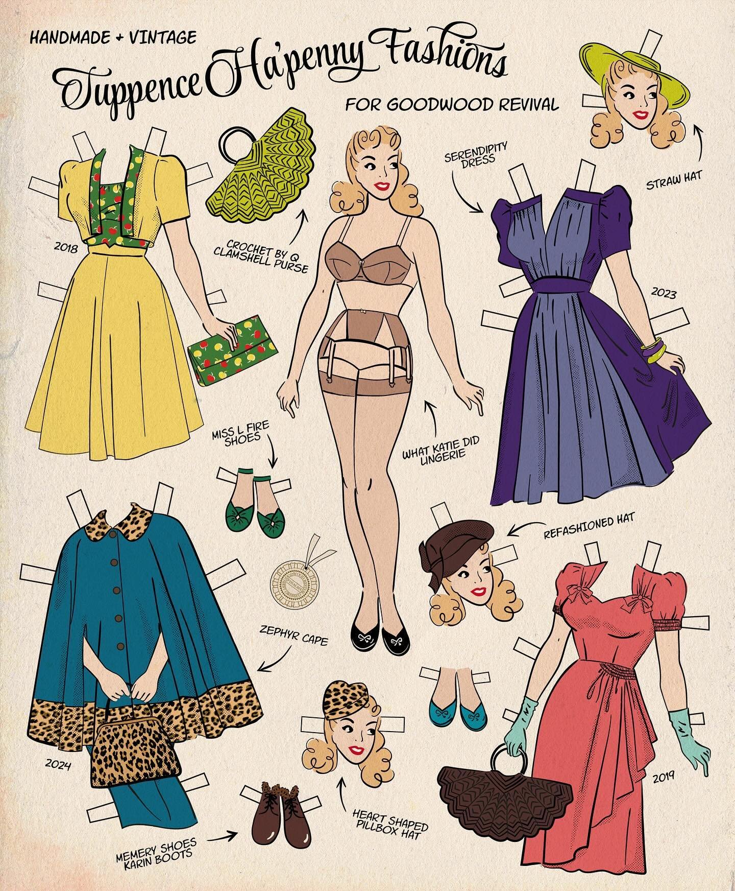
The “Betty” Outfit at Goodwood Revival
Introducing the "Betty" outfit. One of my #2018makenine projects and a long time in the planning, this has been on my list since I saw the 1944 movie "Pin Up Girl" with Betty Grable. This year's #sewingthescene challenge on Instagram finally gave me the push I needed to bring it to life. And when I was invited to attend the Goodwood Revival I knew it was the perfect place for its debut.
The “Carmen” Dress
I’ve written in the past of my love for Victorian glasshouses, but the palm house at Kew Gardens is surely the queen of them all - it’s one of my favourite places in London. My Kew membership allows me to take advantage of later opening times in the summer to stroll through the gardens on my walk home from work, but the glasshouses and galleries close before I get there most days. For just a few months during the high summer though, they stay open an hour later on Fridays. Getting there after the day’s crowds have departed (and away from the madness of the weekends), I often have the quiet majesty of the palm house entirely to myself.
It seemed fitting to debut my latest make, in a tropical-themed novelty print, on the final late opening of the season. And a delight to find the great glasshouse empty, silent except for our footsteps and the droplets of water splashing to the floor from lofty palms. The golden hour light, diffused through the condensation-fogged, curved glass, just added to the magic.
The "Strawberry Daiquiri" Dress
It was at a car boot sale several years ago that I glimpsed this bright hot pink fabric peeking out of a gigantic heap of secondhand clothes that had been dumped out of suitcases right onto the concrete. I think I paid £2 for the dress. It wasn't very exciting - a fairly shapeless 60s shift which had been shortened and let out at the seams at some point in its history. But the colour and the scribbly, atomic-era print really appealed to me. I tried selling it but it never found a buyer, and the dress eventually became a candidate for a refashioning project.
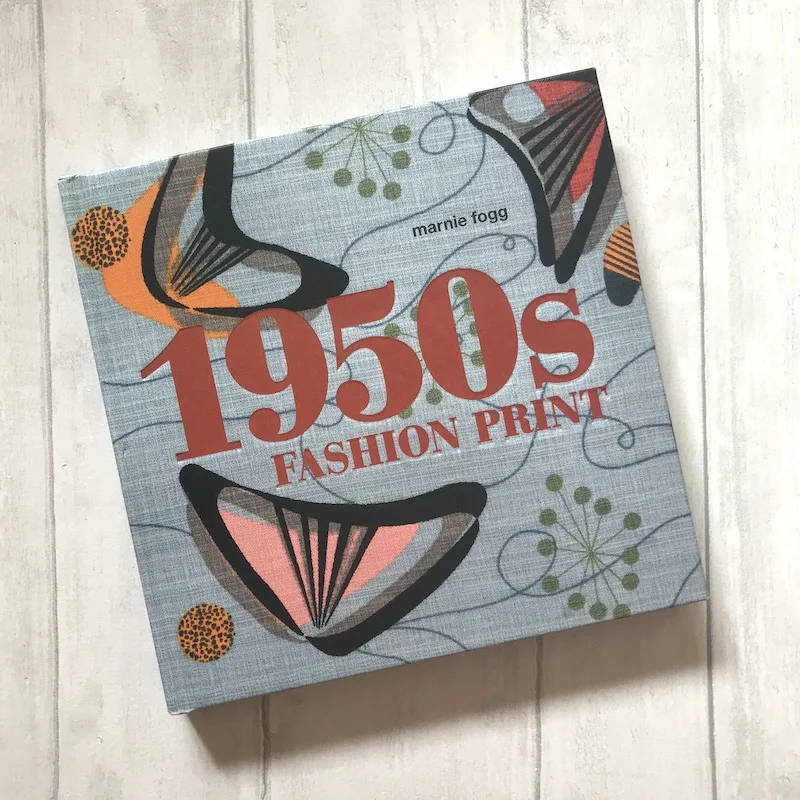
{Bookshelf} 1950s Fashion Print by Marnie Fogg
I can't get enough of vintage novelty "printspiration"; my Pinterest boards are full of novelty designs from the 1940s and 50s - atomic-inspired designs, conversational prints and abstracted florals. What's great about this book is that it puts 1950s fashion textile design in context. The introduction explains the social and artistic influences of the post-war era, including the 1951 Festival of Britain and modern innovations in production processes such as the introduction of an automatic screen printing process in 1957.
The book is arranged into five sections: Abstraction; Narrative, Novelty & The Jive; Artistic Licence; Kinetic; Domestic. Images include reproduced print adverts and sample cards from textile manufacturers as well as full-page prints of fabrics themselves. Each chapter provides additional social context for motifs, style and application, along with commentary and designer/manufacturer details and technical specifications for sampled designs.
The "Bluebirds and Bluebells" Dress
Following on from yesterday's blog post topic of reusing, recycling, making-do-and-mending, I'm delighted to unveil my latest refashion project. This rayon crepe dress was one of the very first 1940s items in my vintage wardrobe, and the first vintage novelty print I owned. Although the waist was a little high on me, and the fit was a bit odd, I worked with it and I wore and loved it. When I noticed that the fabric was becoming very delicate and fraying through at the shoulders, I reinforced the seam, then added an iron-on interfacing and darned it in. It wasn't enough though, and the beloved dress, too delicate to wear regularly, hung unappreciated on a padded hanger in the wardrobe. Until eventually I decided that a print this adorable needed to be worn; it was time to give the dress a new lease of life.
Going Green
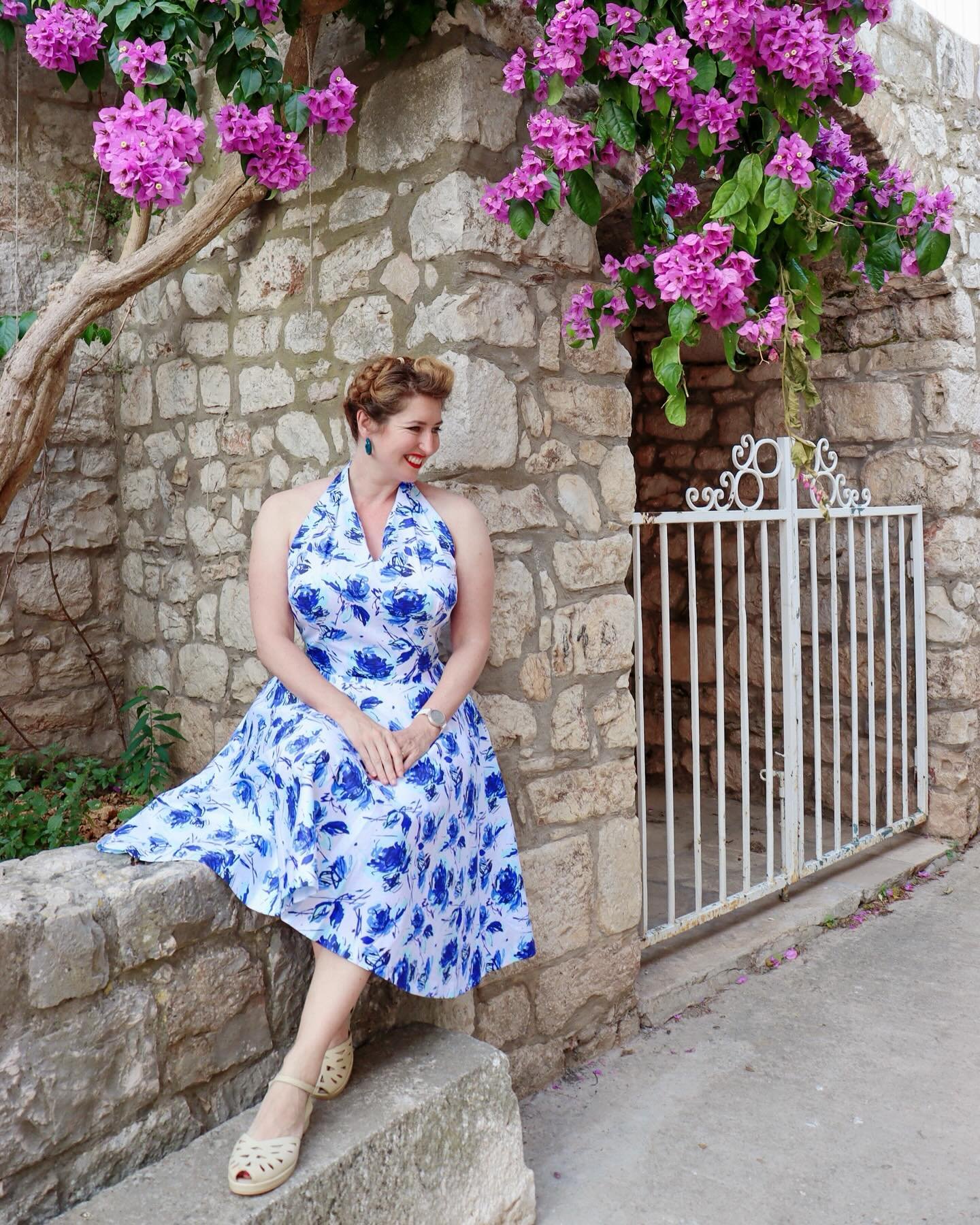
I'm currently participating in #thevintagefashionchallenge on Instagram; this week's themes are colour-based, so this morning we made an early morning visit to Kew Gardens for a green-themed photo shoot. This dress was a charity shop score - it's a modern LK Bennett in silk jersey; I just couldn't resist the novelty key print, especially as at the time I was trying to incorporate more green into my wardrobe. Although it's clearly not true vintage or repro, the silk jersey is amazingly comfortable and I think it styles as vintage quite well.


